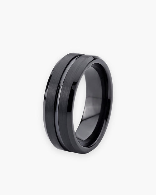
How To Mix Metals In Mens Jewelry
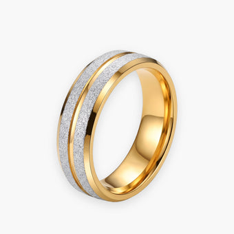
Why Mixing Metals Elevates Mens Style
Mixing metals transforms a standard accessory rotation into a highly intentional aesthetic that reflects deep sartorial confidence. Modern menswear has evolved past the rigid constraints of perfectly matched accessories. By deliberately combining different tones, you introduce depth, visual intrigue, and a personalized signature to your everyday look.Historically, traditional menswear rules dictated that a gentleman must match his watch case, belt buckle, cufflinks, and rings perfectly. While this monolithic approach creates a safe uniform appearance, it often lacks individual character. Breaking away from these archaic guidelines demonstrates a nuanced understanding of modern styling. It shows that your collection has been curated thoughtfully over time rather than purchased as a matching boxed set. For a broader understanding of accessory foundations, reviewing our complete men's jewelry guide provides essential context.

The psychological impact of wearing contrasting alloys cannot be overstated. A gold-tone ensemble can sometimes read as overly opulent, while an entirely silver rotation might feel slightly cold or overly utilitarian. Combining the two brings balance to your presentation. The warmth of yellow tones cuts through the clinical precision of white alloys, resulting in an accessible yet highly sophisticated appearance.
Furthermore, integrating various materials drastically expands the versatility of your wardrobe. When your accessories bridge the gap between warm and cool tones, they naturally harmonize with a wider spectrum of clothing colors. A dual tone approach ensures that your favorite pieces never sit neglected in a drawer simply because they do not match your suit hardware.
Understanding Tonal Balance And Proportions
Achieving visual harmony when combining alloys relies entirely on maintaining a clear dominant tone that leads the overall composition. The most critical error men make is splitting their accessories equally between colors, which creates a chaotic and unanchored aesthetic. Successful execution demands a clear hierarchy of elements.Visual weight plays a fundamental role in how we perceive different materials. Yellow alloys naturally carry more visual weight than white alloys because they reflect light with greater intensity and color saturation. Therefore, a thin yellow chain will draw the eye just as strongly as a thicker white chain. Understanding this optical dynamic allows you to balance your pieces without necessarily matching their physical dimensions.
| Metal Type | Visual Temperature | Optical Weight | Ideal Styling Role |
|---|---|---|---|
| Yellow Gold | Warm | Heavy and bold | Statement pieces or strategic warm accents |
| White Gold | Cool and brilliant | Medium and sharp | Dominant base layers or subtle foundational chains |
| Sterling Silver (not sold by ATLAS) | Cool and slightly muted | Medium to light | Everyday dominant base for casual styling |
| Rose Gold | Warm and earthy | Medium | Transitional accent pieces to soften high contrast |
| Platinum | Cool and luminous | Heavy and dense | Premium dominant base for formal occasions |
When establishing your proportions, think of your body as a canvas requiring strategic distribution. If your dominant tone is white, representing perhaps eighty percent of your accessories, the remaining twenty percent should be placed deliberately. An isolated warm accent acts as a focal point, drawing attention precisely where you want it. This could be a distinct pendant, a single ring, or the bezel of a mechanical timepiece.
Texture also influences how contrasting colors interact. High polish finishes maximize reflectivity and therefore maximize contrast between two different alloys. Conversely, brushed, matte, or sandblasted finishes diffuse light. Mixing a matte white base with a polished warm accent creates a sophisticated interplay of both color and light reflection, adding an architectural quality to your style.
How To Successfully Layer Different Alloys
Successfully layering different alloys requires starting with a foundational piece in your dominant tone before introducing contrasting accents through strategic placement. This sequential approach prevents overcomplicating your outfit and guarantees that every addition serves a distinct stylistic purpose.Can men mix gold and silver jewelry without clashing
Men can absolutely combine white and warm tones without clashing by ensuring that the pieces share a unified design language or structural motif. A minimalist white cuff paired with a classic yellow chain works beautifully because both pieces convey understated elegance. Clashing occurs not from the colors themselves, but from combining incongruous styles, such as a massive iced out pendant with a rugged oxidized biker ring.To execute this correctly, start by selecting your anchor piece. For many men, this is a daily mechanical watch or a meaningful signet ring. This anchor establishes your dominant baseline. If your watch is predominantly stainless steel, your secondary and tertiary pieces on that same arm should ideally align with that tone, reserving the opposite limb for your intentional color contrast.
When navigating the complexities of neckwear, spatial separation becomes paramount. If you are exploring Men's Necklaces & Pendants, consider varying the lengths of your chains to create physical distance between the conflicting colors. A shorter white foundational chain sitting above a longer, slightly thicker yellow pendant chain prevents the materials from physically overlapping and tangling.
Mastering the art of mixing jewelry metals men
Mastery requires understanding the concept of tonal bridging. Tonal bridging refers to the styling technique of utilizing a single bi-color accessory, such as a watch with a two-tone bracelet, to visually anchor and unify separate solid-color metallic elements worn on the same body. This piece acts as a stylistic translator, giving your entire outfit permission to explore both sides of the color spectrum.Consider the following step by step methodology for layering:
- Identify your daily non negotiable pieces like a wedding band or a favorite watch to serve as your color baseline.
- Select your dominant tone for the day based on your wardrobe palette, favoring warm tones for earth colors and cool tones for blues and grays.
- Introduce your secondary tone through a single deliberate accent piece, ensuring it occupies less than a third of your total accessory real estate.
- Match the overall formality of the pieces to prevent stylistic dissonance, keeping rugged textures with rugged designs and polished sleek pieces together.
- Create physical separation between heavy contrasting pieces by distributing them across different zones like the neck, left wrist, and right hand.

Advanced Techniques For Creating Cohesive Looks
Advanced styling relies on manipulating texture, spacing, and surface finishes to bridge the gap between contrasting colors effortlessly. Once you have mastered the basic proportional rules, you can begin experimenting with nuanced variables that elevate your presentation from competent to exceptional.Integrating gold and silver together men
Integrating contrasting tones successfully on a single limb requires exceptional attention to gauge and thickness. When stacking items from our Men's Bracelets collection, never place two pieces of identical thickness in conflicting colors directly next to each other. Instead, allow a dominant thick white piece to be flanked by a considerably thinner warm piece. This differential in size clarifies that one is the feature and the other is the frame.Another highly effective advanced technique is mirroring. If you wear a warm accent on your left hand, echo that warmth subtly on the right side of your body, perhaps through a warm toned pendant or a subtle lapel pin. This creates a diagonal line of visual symmetry across your torso, tying the disparate elements together into a cohesive sartorial narrative. Fashion publications like GQ frequently highlight this diagonal balancing technique in their high end editorial spreads.
Do not overlook the influence of negative space. Crowding too many pieces together forces the eye to process a chaotic block of color. By allowing an inch of bare skin between a watch and a contrasting cuff, you frame each piece individually. Negative space acts as a visual palate cleanser, allowing the opposing tones to exist harmoniously without competing for dominance.
Furthermore, integrating mixed material pieces can serve as an excellent intermediate step. Accessories featuring leather, woven cord, or natural stone elements alongside metallic accents break up the continuous shine of pure alloys. A black leather strap featuring yellow hardware next to a solid white cuff softens the transition, making the contrast feel organic and grounded.
Common Pitfalls When Combining Finishes
The most frequent error in dual tone styling is splitting metal colors evenly, which creates visual confusion instead of an intentional contrast. Without a clear hierarchy, the eye bounces endlessly between the opposing tones, resulting in an outfit that appears indecisive rather than thoughtfully curated.Essential rules for mixing metals jewelry
The primary rule to remember is avoiding stylistic contradiction. While you can mix colors freely, mixing vastly different cultural or stylistic aesthetics rarely works. A sleek, futuristic white architectural ring will always clash with a highly ornate, vintage engraved yellow signet ring. The colors are not the enemy in this scenario, the conflicting design philosophies are.Another significant pitfall is neglecting the hardware already present on your clothing. Zippers, belt buckles, shoe buckles, and sunglass frames all contribute to your total metallic footprint. If you are wearing a jacket with massive brass zippers and a belt with a heavy brass buckle, introducing a large amount of white accessories will disrupt the balance. Always survey your garment hardware before finalizing your gold jewelry styling for the day.
Avoid these specific mistakes to maintain a refined appearance:
- Stacking multiple rings of alternating colors on adjacent fingers, which fragments the visual flow of the hand.
- Wearing heavily oxidized vintage pieces alongside highly polished modern pieces in contrasting tones.
- Allowing pendants of different colors to hang at the exact same length, causing them to physically strike one another and tangle.
- Ignoring your skin undertone completely when selecting your dominant base layer.
- Over accessorizing to force a mixed palette, wearing more pieces than necessary simply to showcase both colors.

The ATLAS Approach To Modern Masculine Style
Precision engineering in wearable architecture requires an uncompromising approach to how raw materials interact upon the skin. ATLAS designs every piece with metallurgical exactness, ensuring our varying finishes possess complementary reflective properties that make dual tone styling inherently intuitive. Our collections are built on the philosophy that modern masculinity demands versatility without sacrificing an ounce of quality.At ATLAS, we understand that true luxury lies in the details. The density, the surface tension, and the exact hue of our alloys are calibrated to perform exceptionally well when layered. A white piece from our collection shares the same underlying architectural DNA as our warm pieces. This structural consistency means that even when you contrast colors aggressively, the aesthetic remains unified and deliberate.
ATLAS focuses on modern masculine style by refusing to compromise on foundational craftsmanship. We do not rely on transient trends. Our pieces are 316L stainless steel, titanium steel or tungsten carbide, and we say plainly when a finish is plated. Whether you are building a completely uniform rotation or exploring complex mixed palettes, our architectural approach guarantees a presentation of absolute authority.
 Scopri i pezzi della guida
Men's Cubic Zirconia Band Ring, Titanium Steel
89,99 €
Acquista ora →
Scopri i pezzi della guida
Men's Cubic Zirconia Band Ring, Titanium Steel
89,99 €
Acquista ora →
Building Your Personal Metal Palette
Constructing a personalized palette involves identifying your skin undertone to select a dominant base before carefully curating secondary accent pieces. Just as a master painter understands their canvas, a stylish man must understand how different reflective surfaces interact with his specific complexion to achieve optimal results.Determining your skin undertone is a straightforward process. Examine the veins on the underside of your wrist under natural daylight. If they appear distinctly blue or purple, you possess cool undertones, meaning brilliant white alloys will naturally complement your skin. If your veins appear green, you possess warm undertones, making rich yellow alloys exceptionally flattering. If you cannot easily distinguish between green and blue, you likely have a neutral undertone and can effortlessly utilize either tone as your dominant base.
Once your dominant tone is established, you can begin exploring secondary additions. If you favor a silver accessory rotation as your primary aesthetic, consider integrating a slim yellow cuff or a subtle yellow pendant as your signature wildcard piece. Resources like The Art of Manliness echo the importance of having a signature piece that breaks the mold of your standard rotation.
Building this collection should be a marathon, not a sprint. Follow these principles for long term curation:
- Invest heavily in your dominant tone first, ensuring you have a complete foundational set before branching out.
- Select your contrasting accent pieces based on versatility, choosing minimalist designs that will not overpower your outfit.
- Consider the seasonal variations in your wardrobe, utilizing warmer tones during autumn and cooler tones during winter.
- Pay attention to how your pieces age, as worn finishes often blend more seamlessly than pristine factory fresh finishes.
Frequently Asked Questions About Combining Alloys
These frequently asked questions address the technical and aesthetic nuances of combining different alloys in modern menswear. Understanding these finer points will elevate your daily styling routine and prevent common sartorial missteps.Why trust Atlas on men's jewelry?
Every Atlas guide is checked against our own product specifications. Our pieces are 316L stainless steel, titanium steel or tungsten carbide, and we say plainly when a finish is plated. Orders are processed within 24 hours, returns are accepted for 30 days, and every piece carries a 1-year warranty.
How do you balance visual weight when layering different alloys?
Balancing visual weight requires acknowledging that warm tones naturally draw the eye faster than cool tones due to their richer color saturation. To achieve equilibrium, you must offset a small amount of warm alloy with a larger volume of cool alloy. For instance, a remarkably thin yellow cuff can visually balance a thick, substantial white steel watch. You should never attempt to match the physical dimensions of contrasting pieces exactly, as this creates a distracting visual competition. Instead, allow the cooler tone to act as the heavy foundation while the warmer tone acts as the lightweight, striking highlight. This strategic distribution ensures the eye travels smoothly across your entire presentation.
Should my luxury timepiece match my rings exactly?
Your luxury timepiece does not need to perfectly match your rings, though it should dictate the overarching formality of your accessories. A highly polished dress watch demands rings that possess a similarly refined, elegant finish, regardless of their specific color. However, breaking the color match between a watch and a ring is one of the most effective ways to introduce intentional contrast. A stainless steel sports watch pairs exceptionally well with a yellow gold signet ring on the opposite hand, provided the ring shares a substantial, masculine geometry. Ultimately, coordinating the texture and design philosophy is far more critical than identically matching the raw materials.
How does skin undertone affect my dominant tone choice?
Your skin undertone acts as the biological canvas for your accessories and significantly influences how cohesive your dominant tone will appear. Cool undertones with blue veins naturally harmonize with the crisp brilliance of white alloys, creating a clean and integrated aesthetic. Warm undertones with green veins are beautifully enhanced by the rich radiance of yellow alloys, bringing out a healthy glow in the skin. Ignoring this natural compatibility can cause certain materials to look stark, harsh, or visually disjointed against your complexion. While you can wear any color as an accent, ensuring your dominant, heavy pieces complement your biological undertone provides the most flattering and natural foundation.
Can you mix polished and matte finishes across different colors?
Mixing polished and matte finishes across contrasting colors is an advanced technique that yields incredibly sophisticated results when executed deliberately. The variation in surface texture helps diffuse the stark color contrast, making the transition between the two materials feel less abrupt. For example, pairing a matte white base layer with a highly polished warm accent emphasizes the accent piece beautifully while keeping the foundation understated. However, this technique requires strict adherence to proportions, as randomly mixing textures and colors in equal amounts will appear highly disorganized. When applying this method, always keep the matte finish on your dominant tone and reserve the high polish for your strategic accent pieces.
Final Thoughts On Dual Tone Styling
Mastering this aesthetic technique grants you total freedom to wear your entire collection without being restricted by outdated sartorial boundaries. The modern man understands that style is an expression of intentionality, and carefully contrasting your accessories is a profound demonstration of that intent. It transforms a simple outfit into a layered, complex narrative that commands attention.As you continue to refine your presentation, remember that the overarching goal is cohesive contrast rather than chaotic clutter. Start slowly with subtle bridging pieces, respect the proportions of your dominant base, and always prioritize matching textures and design philosophies. For more comprehensive styling principles, explore our comprehensive styling principles in the journal. Embrace the versatility of mixed palettes, and allow your personal aesthetic to evolve with confidence and precision.